Simple Website

Who? Simple
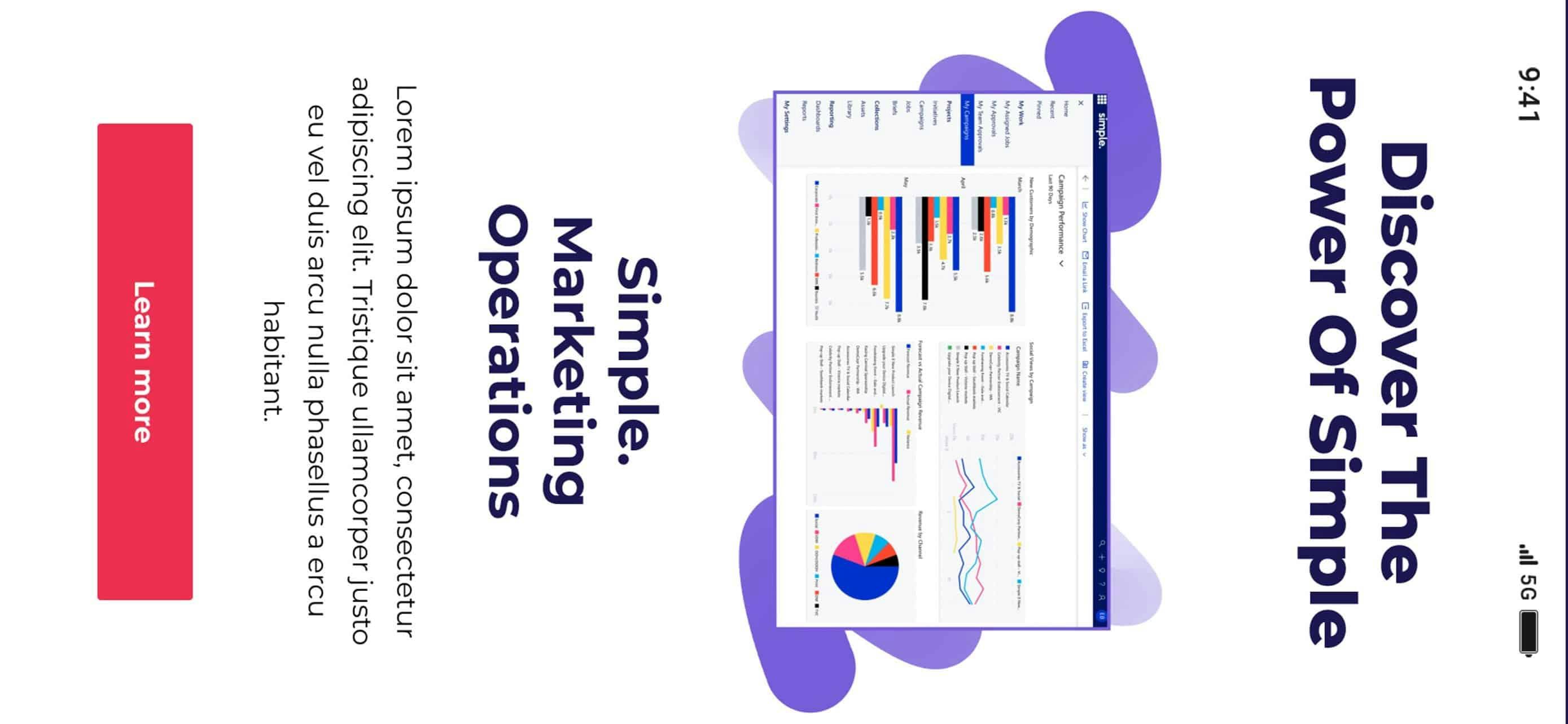
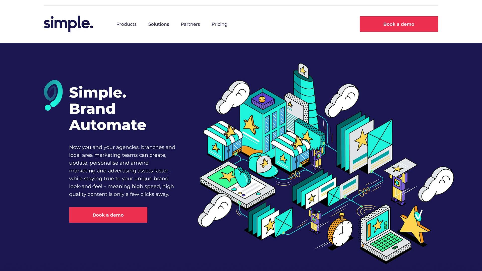
Simple creates the products that make marketing operations easier. It is simplifying the workflow for marketing teams and making clunky project management a thing of the past.
Why? To generate leads
Simple’s existing website was overloaded with information. This made the user journey feel complex; visitors struggled to navigate the site and to find the calls-to-action they needed to complete their goals. The site wasn’t generating the leads it could.
How? A streamlined website
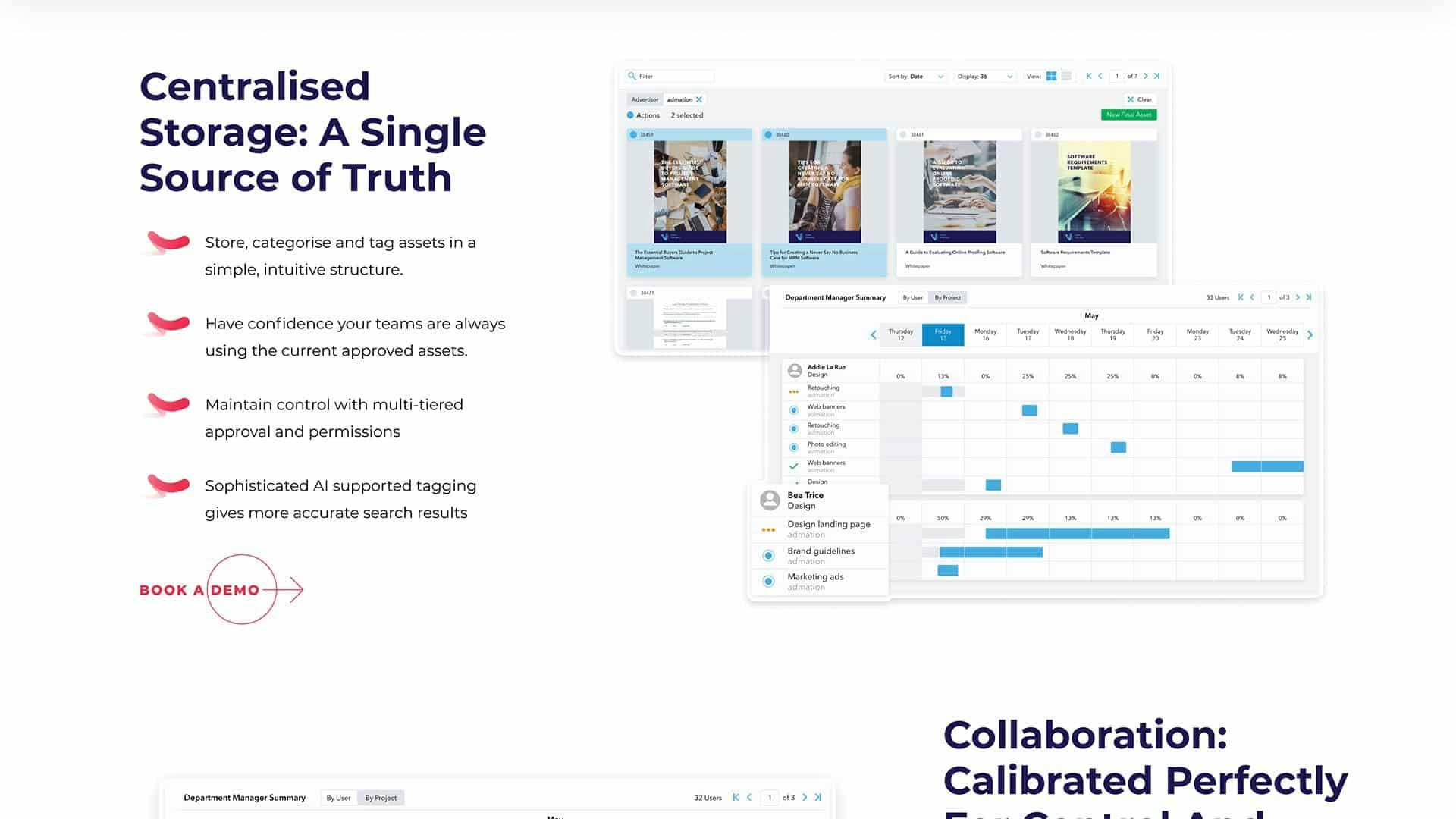
A discovery session combined with market research helped us determine the best layout for Simple’s website. This infrastructure would optimise the customer journey to generate more leads and sales for Simple.
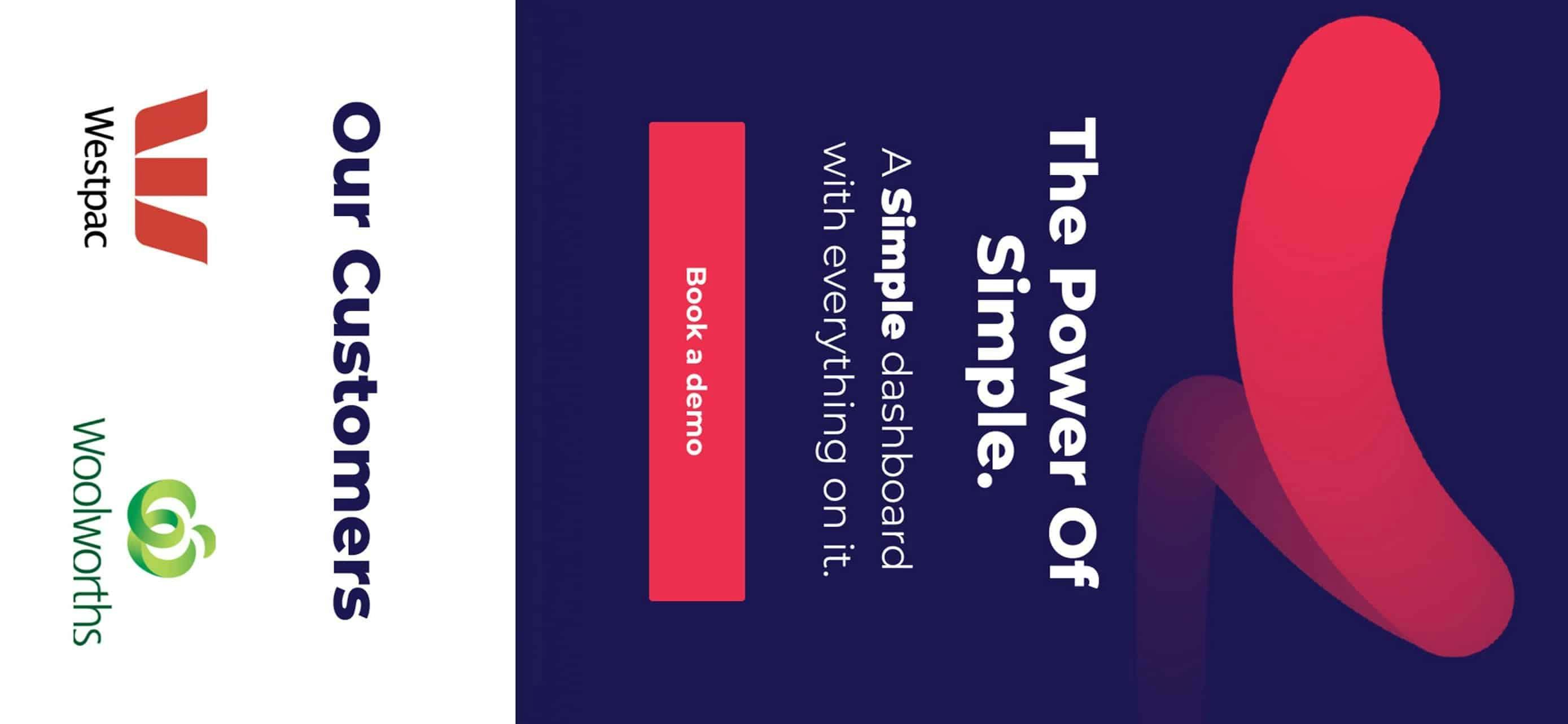
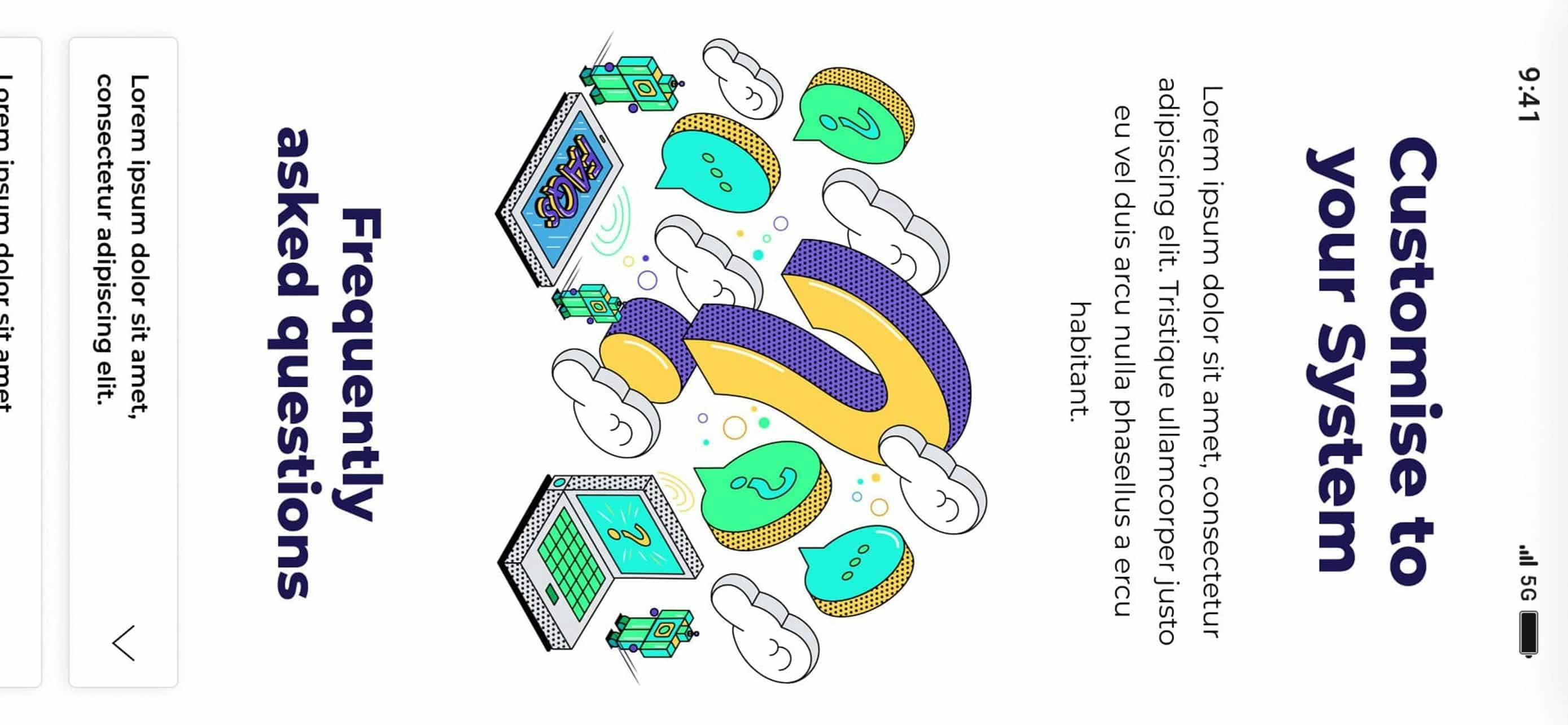
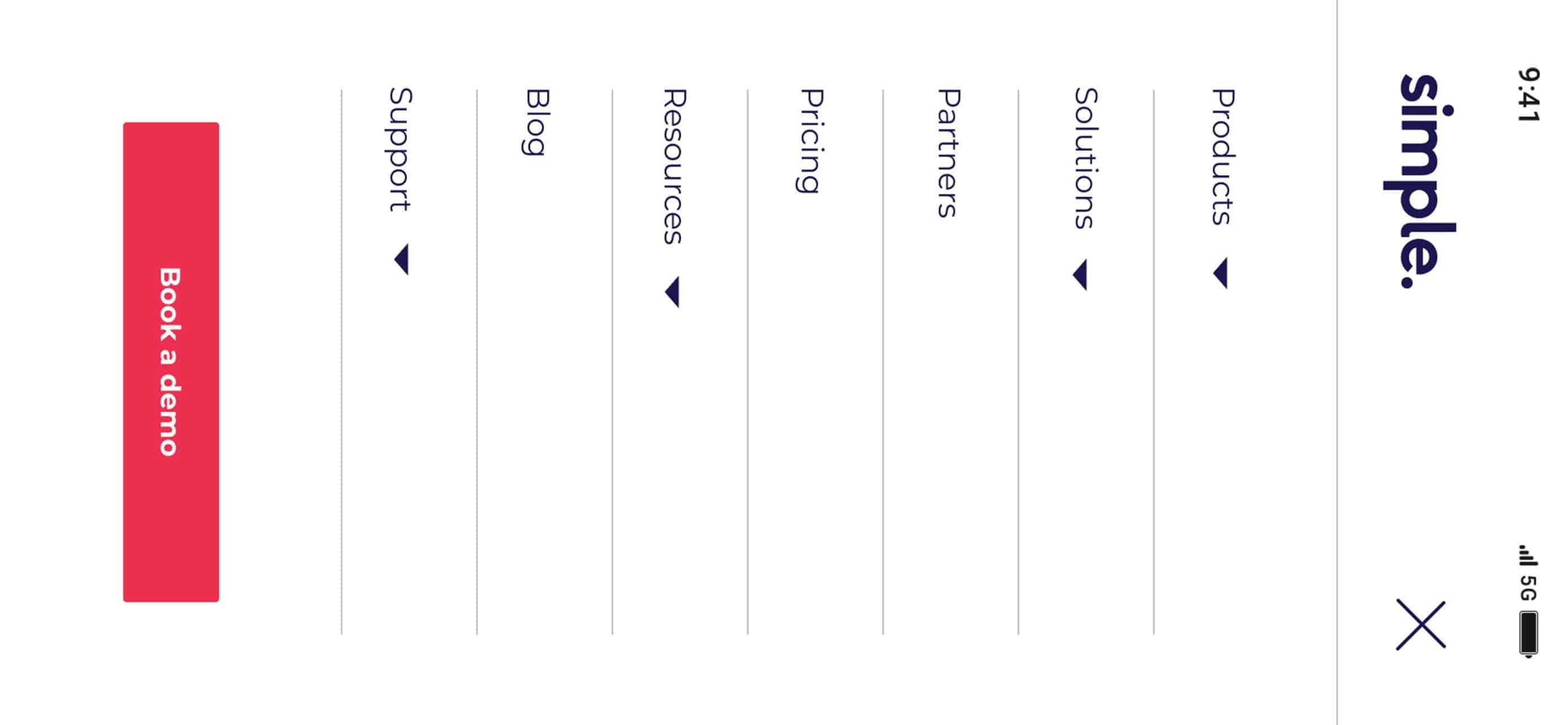
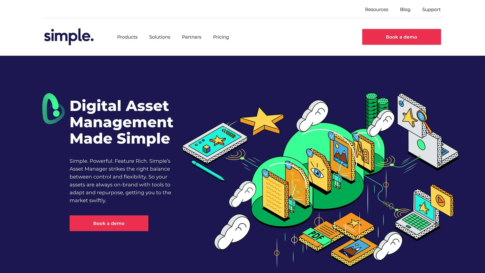
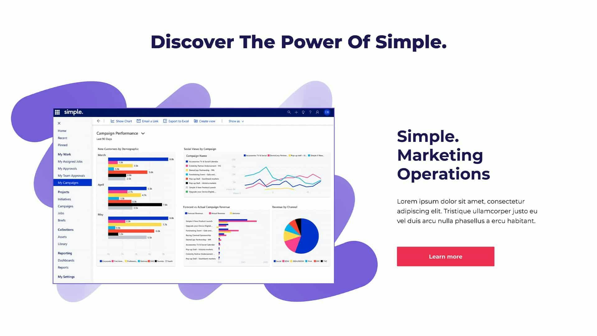
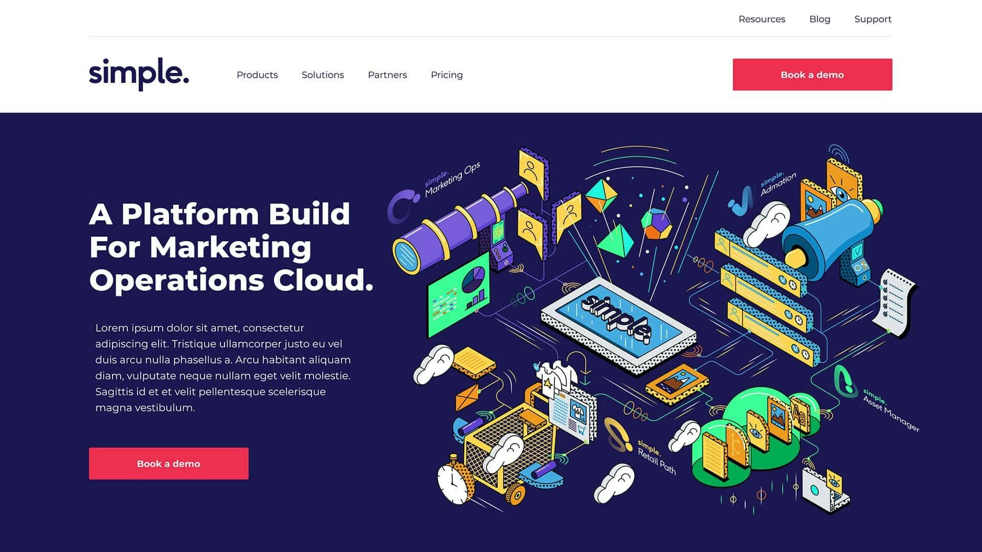
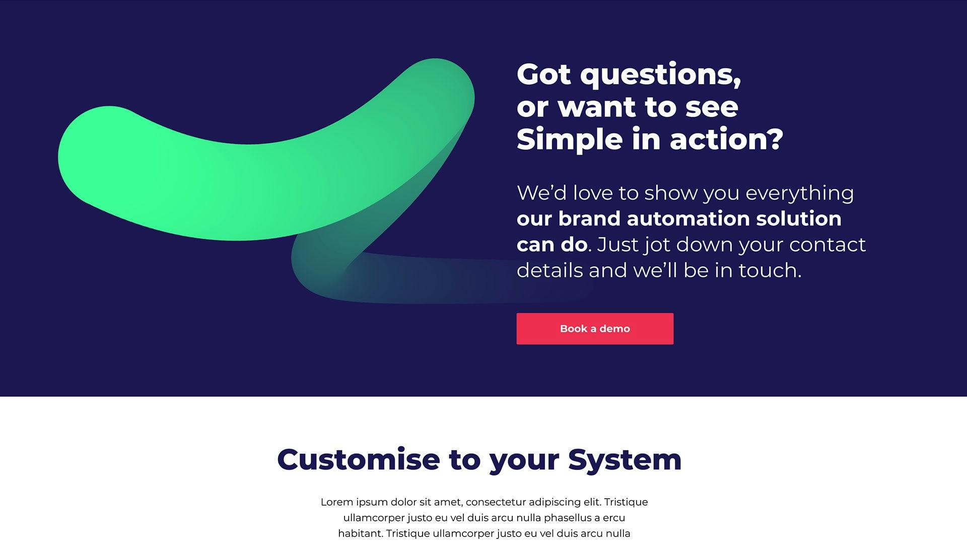
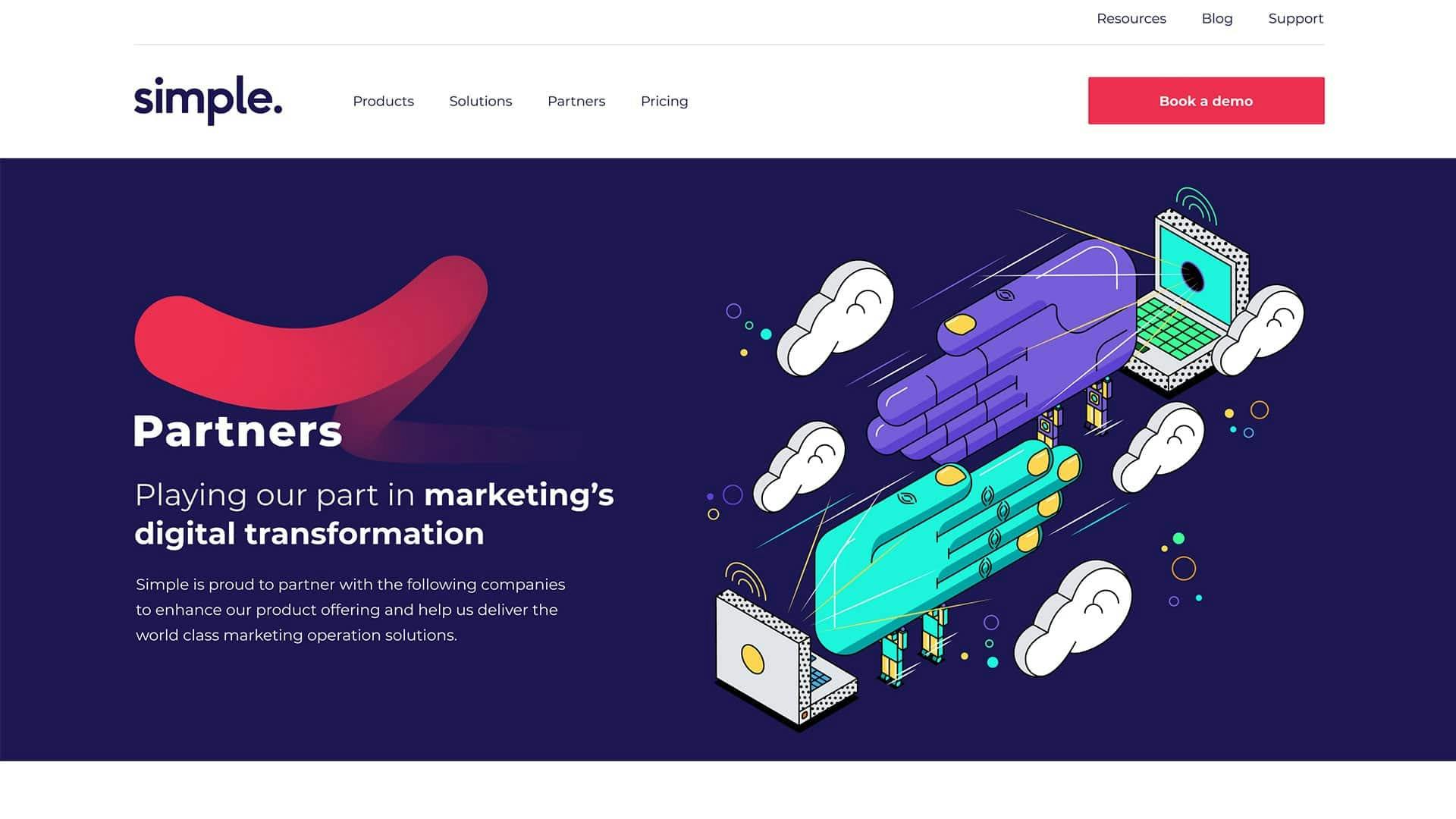
We placed the ‘Book a Demo’ CTA in places where it made most sense for the user, so the website would no longer interrupt user flow. We also made sure visitors could find clear information about the product they were interested in.
What now? The stats
With a better website layout, we were able to optimise UX/UI and as a result, Simple began receiving more leads and it is growing over time.
UX/UI Design Desktop & Mobile
Place your mouse on top of the screen and scroll up & down